There are few parts of the process that delight me as much as making the paint elevations. While having accurate drafting is certainly crucial, I would argue that paint elevations are sometimes even more crucial to ensuring that the final work looks exactly the way you as the designer would wish. Paint elevations are where you detail everything from color to texture.
I will fully admit my bias; I worked as a scenic artist for years and that training has given me a very strong appreciation for how much a good paint treatment can make or break a design. It’s important for structures to be built well an correctly, but it’s the paint and other treatments applied to the structures that almost magically shift them into the realm of the world. A good scenic artist is a designer’s best friend.
Making paint elevations is my favorite part of the process. Paint elevations are where you get to finesse all the juicy details and the sparkle. If drafting is the main body of the cake, then paint elevations are all the frosting and decoration. Making the model is fun, but much of the detail is lost because of the scale. Elevations are where you get to blow everything up big and show off all the patterns and depth that is lost in the tiny surfaces of the model. It’s the part of the process where I feel most purely like an artist, adding a stroke here and there to the work to build up the flesh and features on this body we have made.
The goal of paint elevations is simple. For every piece of scenery in the show, you want to communicate the following:
Color Specifics: This means not only showing the color in the piece itself, but also pulling out swatches of color that you used to get the final product. All treatments are comprised of layers of color, thus it’s really helpful to separate out those layers into a palette so scenic artist has to do less guesswork.
Textures: This is a big one. When looking at a paint treatment in an elevation, you can’t always tell at first glance if there is any three dimensional texture compound or if it’s simply a two dimensional treatment that’s meant to give the appearance of texture. Both approaches are valid depending on the show, but it’s definitely up to the designer to communicate which option they want because each reads very different on stage.
Finishes: This refers to the sheen/reflectivity of a give surface. Much like in the world of house paint, the shiny aspects of a surface are very important to note; especially for a space that is going to be flooded with very bright light. Finish is also important in determining how much maintainability a piece will have throughout the run, given how much abuse scenery and stage decks especially experience (i.e. dancing, dramatically clutching walls, etc.).
While you try and notate the broad strokes of expected paint treatments in the drafting (after all, textures and finishes definitely affect how the technical director will tech the scenery), the paint elevations are where you get granular. Combining the elevation of the piece itself with research images, swatches, and notes, you effectively communicate to the scenic artist how you want a piece to appear.
For Little Shop I chose to build the elevations of the pieces digitally, and then arrange the final full paint elevations by hand (including hand writing the notes). When creating the elevation of the pieces, you can choose to paint by hand. This has the advantage of being a representation of the piece in a medium that is directly translatable; in other words, painting by hand is often easier to transfer to painting in larger scale. However, in the case of Little Shop, I had been building the elevations digitally for the models. Thus, in the interests of time and consistency with all my material, I chose to build my large elevations digitally.
I am a fan of handpainted elevations. Usually, that’s how I tend to work. Making the digital elevations for Little Shop was in part a challenge for me. Creating textures and treatments digitally requires tools and choices that aren’t necessarily available to a scenic artist in a one-to-one relationship (ex. If I want something to fade back in Photoshop, I can toggle the opacity of that layer. Opacity in scenic painting is achieved by manipulating the opacity of the paint which obvious doesn’t always behave in the same fashion of how pixels print). The challenge for me was to create paint elevations that would clearly show the scenic artist (in this case, the fierce and indomitable Daniela Weiser) what I wanted, and that they would be treatments she could confidently translate and re-create in real life from my elevations.
When building the paint elevations for Little Shop, I would start with creating the digital elevation of the piece of scenery. Let’s use the facades that would have gone on the splay walls (Shakespeare doors) of the theatre as an example (mostly because they became my favorite elements of the show in terms of paint treatment).

Digital Elevation of the Splay Wall Covers
( Side Bar: I love these facades so much because they were the result of one of my favorite collaborative moments with Dexter (Director). In an earlier version, we had thought the coverings might look like the backs of buildings. However, moving forward in development, Dexter saw that the previous choice wasn’t quite working anymore. He wanted more of a story from those units and he asked if we could make them other storefronts instead. This set off an animated back and forth where he and I volleyed ideas and came up with these two facades. We wanted to use them to deepen the layers of our Skid Row. At the top of the show, we see the pawn shop is already foreclosed, but the beauty supply shop is thriving. By the end of the show, we would see the decline of Dee’s as Audrey 2 takes over the world with its nefarious plans. Obviously this would have been very much in the background compared to the main story, but these are the details I love. These are the elements that ground you in this world, that lend more support to the events you are about to witness. And it’s always especially fun when the elements were born out of a particularly inspiring moment of collaboration).
Anyway, back to our main thrust, after the digital building of the main piece, I’ll also digitally collect swatches and research images that can help further clarify the main piece. With that done, I will print, cut, and arrange into the final paint elevation.

Final Paint Elevation for Splay Wall Covers
In this way, I built elevations that have the consistency and accuracy of the digital components, while still including a touch of the personal in the arrangement and my handwritten notes. Little Shop was a large show, and I had a lot of fun making the elevations.

Florist Shop Facade and Signs

Florist Shop Walls and Front Door

Florist Shop Floor and Soffet

Mid Stage Urban Texture Units

Upstage Portal Unit

City Skyline

Deck Treatment

Dentist Office Screens

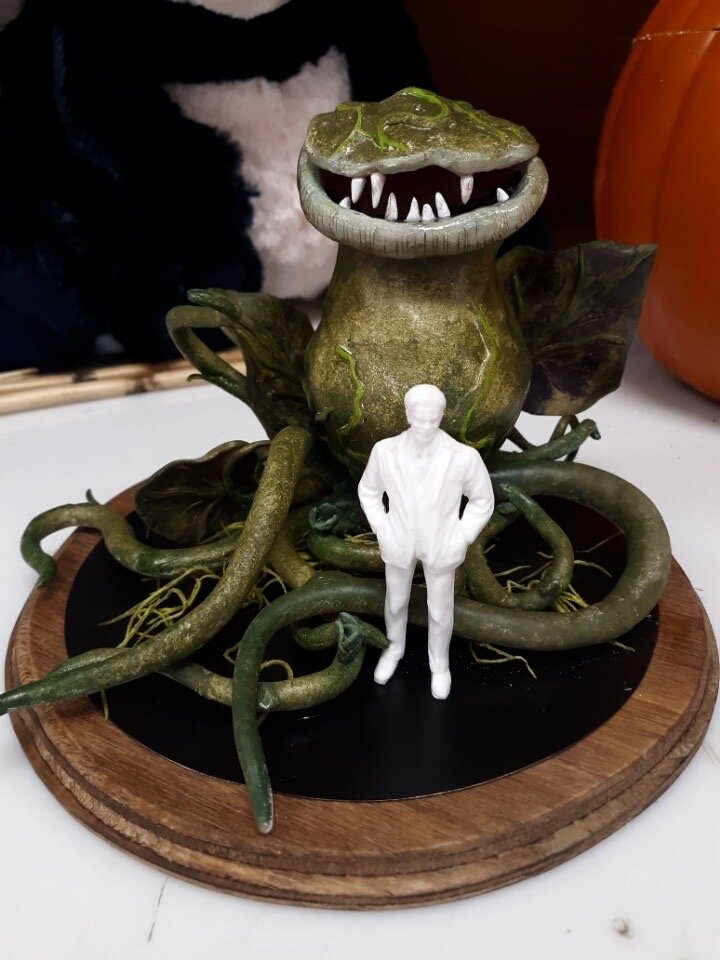
Oh, did I mention that we were going to have super fun mini-plant drops fall across the storefronts as part of the Finale Don’t Feed The Plants? ;)
Like I said, I’m probably just biased, but I think paint elevations are one of the best ways to see the artistry in the design. I’m proud of these and definitely feel that I improved my digital rendering skills dramatically for this show.