design team

Squad Pod: #3 Team Costume Design by Kristen Zarabozo

My fave pic of the three of us, no competition

My fave pic of the three of us, no competition

In this edition of Squad Pod, it is pleasure beyond describing to post audio of chats with two of my favorite people on this planet! The first chat is with costume designer for Little Shop of Horrors, Jessica Haswell. The second chat is with Brittny Mahan, who was the assistant costume designer on the show.

These two women have been instrumental peers in my time in grad school. We came in at the same time, along with our fellow colleague Toni Sterling (who’s a killer lighting designer!) three years ago. While we formed so many relationships with the rest of our peers, there is certainly something powerful about being running mates from the beginning. I think Jess and Brittny are incredible artists. I’m also blessed to know them as friends as well as colleagues, which has made working together even more of a joy.

Jess and I had actually worked together on a CRT show the previous season (Henry IV: Parts 1 and 2.) We also spent plenty of time together in our little corner of the lab, choosing to share our working space after our first year. If there is one thing that makes my chest tight when I think about the show’s cancelation, it’ the fact that we didn’t get a chance to see Jess’s costumes alive and beautiful, worn by our incredible cast. While her renderings are certainly gorgeous and definitely give you a clear idea on what her design would be, I would be lying if I didn’t also say that I’m still a little sad when thinking about how awesome they were going to be on the body. Like me, this was her MFA Project, so it did sting a little extra for us to have our last piece as grad students stopped before production. Still, chatting with Jess about her process was a joy and delight and I hope the selection of renderings shown here can give you a taste of just how talented she is. Definitely check out her website jessicahaswelldesign.com

Disclaimers, Corrections, Clarifications: As with the other episodes, we are just two artists chatting about our work and life. Anything we say is often based in opinion and our own experience and therefore nothing should be taken as a firm declarative of the “only right” or anything of that sort.

A little blurry, but I really love this picture of us!

A little blurry, but I really love this picture of us!

Looks for Ya Never Know (Seymour and Do-Op Girls)

Looks for Ya Never Know (Seymour and Do-Op Girls)

The Do-Op Girls, look for Closed for Renovation

The Do-Op Girls, look for Closed for Renovation

Call Back in the Morning and Meek Shall Inherit

Call Back in the Morning and Meek Shall Inherit

Super fun amazing sparkly fabric Jess was looking to use for the look in the rendering directly above

Super fun amazing sparkly fabric Jess was looking to use for the look in the rendering directly above

Subsequent to the Events You Just Witnessed

Subsequent to the Events You Just Witnessed

Look 2 for the three principles

Look 2 for the three principles

Audrey and Orin

Audrey and Orin

Act 2 Beginning Look for three principles

Act 2 Beginning Look for three principles

Sominex

Sominex

Don’t Feed the Plants

Don’t Feed the Plants

Next audio we have is a chat with the indomitable Brittny Mahan, who was acting as Jess’s assistant on this show. She has also designed multiple shows at CRT (Crucible, Mystery of Edwin Drood, and Shakespeare In Love) and she is pretty much a rockstar human on every level. Definitely check out her website as well, you will never be sorry that you worked with this woman www.brittnymahan.com.


Disclaimers, Corrections, Clarifications: Again, we are just chatting about our work and our field. At one point, we do get a little into it about payment and monetary compensation for work in the professional world, and we did make a point to say we don’t get paid hourly. To be clear, assistants are often paid by the hour, we were mostly referencing designer compensation in that moment. Further to that point, we are not necessarily advocating that everything shift to hourly measures for compensation; rather that the level of work and skill that designers bring to the production should be appropriately compensated financially. This is particularly poignant for costume designers especially who have, anecdotally and historically speaking, often received the lowest pay on the creative team.

On this Episode of KP Gaffes: At one point in the recording, I say that a certain amount of time Brittny mentions is “less than a month,” when in fact the time frame she relates is a little over a month. Time is really screwy in grad school, warps the mind I swear.

Fab pic of us at the Prague Quadrennial last year

Fab pic of us at the Prague Quadrennial last year

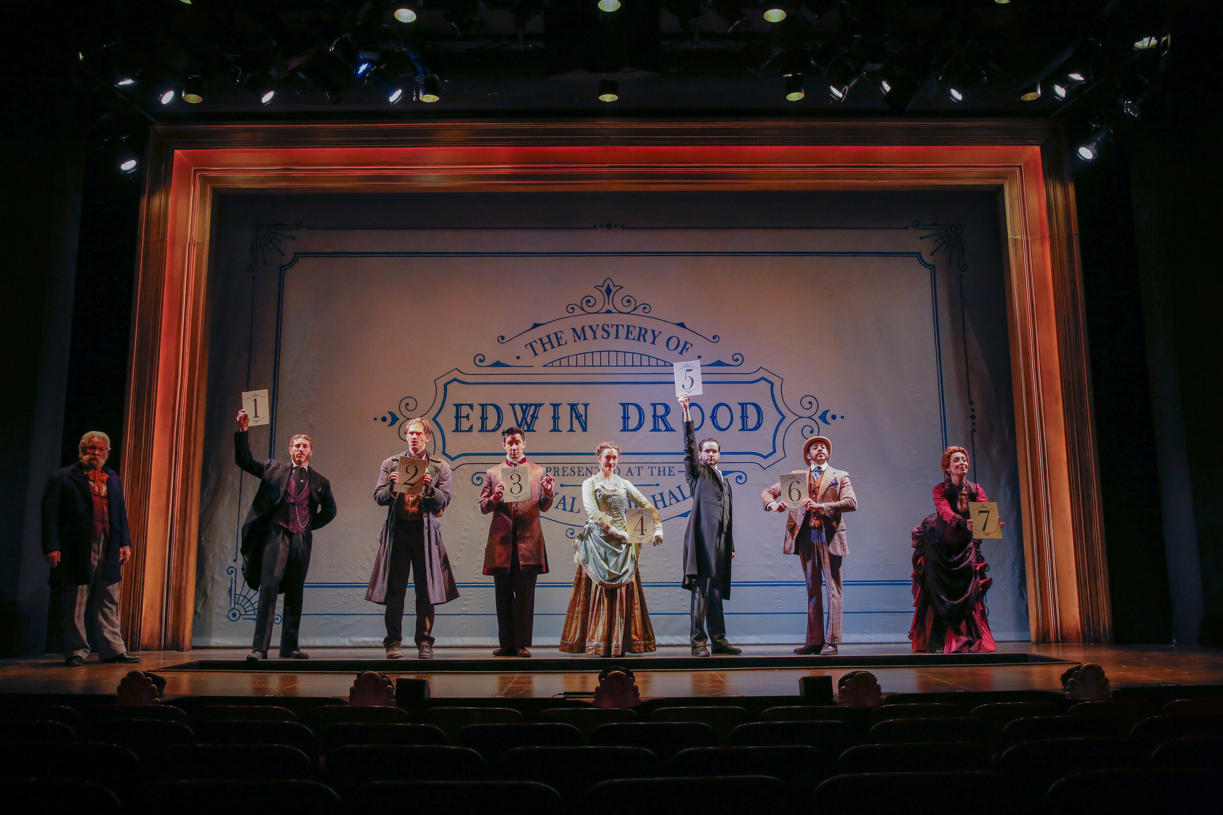
Since work stopped before we could get pictures of how Brittny’s assistance contributed to build for Little Shop, I wanted to include a couple pictures from another CRT show. This is Mystery of Edwin Drood, for which she was the costume designer

Since work stopped before we could get pictures of how Brittny’s assistance contributed to build for Little Shop, I wanted to include a couple pictures from another CRT show. This is Mystery of Edwin Drood, for which she was the costume designer


Another shot from CRT’s Mystery of Edwin Drood

Another shot from CRT’s Mystery of Edwin Drood

Okay, now just standby for the love fest. I’m going to miss seeing these ladies all the time as I have become accustomed. Our industry is very small, so we shall certainly cross paths again. Still, I’m going to miss this loves, you were huge part of a very involved three years. We did it!!

Costume designers abroad!

Costume designers abroad!

I had to include this one, the drama is just perfect!

I had to include this one, the drama is just perfect!

We decided that if for some reason we ever release an album, this is def the cover

We decided that if for some reason we ever release an album, this is def the cover

My heart to you both, you made these three years amazing!!

My heart to you both, you made these three years amazing!!


Episode 5: The White Model by Kristen Zarabozo

Actual picture of me in my natural model making state without assistants

Actual picture of me in my natural model making state without assistants

So we start getting into the rock stars of the scenic design world: the model. Models are obviously not only limited to the realm of scenic design, but they are an essential tool for communicating and (in a way) proving a design. They are the closest you can get to actually test driving how everything is going to look in real time. As has been told to me many times, “We work in a three dimensional art form and so we should be showing our designs through a three dimensional medium.”

There are many advantages to a physical model. You are creating a tool that can accurately inform you down to the inch if what you are thinking is even going to fit, let alone look good in the space. To put something “in scale” means simply that we can shrink the whole world down by logical proportions to a size that we can put in a box and carry around (although admittedly some scale sized models are still enormous relatively speaking). You take increments of measurement (in the case of America increments of the inch while the rest of the world calmly goes about using metric increments) and simply make it equal to 1 foot in real life. For show models, I tend to work in 1/4”=1’-0” scale. While still tiny (think about it, a person measuring 6’ in real life is only an inch and a half tall in scale), you can get enough detail to communicate the idea while still keeping the whole model relatively manageable in size.

The model is an excellent communication tool, especially for the director. While a ground plan drafted out can be helpful, the model really conveys the whole meaning and consequences of each piece in in the actual space, in all the planes that matter to the performance (i.e. three dimensions). It’s all about the idea of “show don’t tell.” Words are very easy to confuse or misinterpret, but if you can pick up a piece and move it around in the actual space in this tiny world, that gets everyone a lot closer to being on the same page about what the design is shaping into.

White models are a kind of first draft of the space, some designers will even refer to them as “sketch models.” The process is similar to a sketch in the sense that you are trying to rough out ideas and just get something down on the page; only with the model it’s inside a scale replica of the theatre. Despite this designation, white models can be as simple or complicated as desired. They are called white models because they are often made out of white paper materials and don’t have color applied. Some are truly just the simplest shapes while others are works of art showing off all the architectural buildups and detail. However, the usual point of a white model is to get the basic gesture of the set, possibly starting to play with texture and smaller details.

My process isn’t terribly unique for a number of designers working in the industry at present. For models, I tend to draft the pieces in a computer program that I can then print out to cut and install. I happen to work out of Vectorworks, but that’s more a matter of comfort for me personally than any specific advantage the program offers. Drafting things in the computer is a marvelous modern wonder that I’m not embarrassed to admit still amazes me. I can make the piece with absolute accuracy and then reproduce it swiftly and, again, accurately, as many times as I wish. And trust me, for a model, that is crucial.

I make what’s called a model kit. This simply means that I draft the pieces so that they are a flat version of the object that can be built up during the install. Think about a four legged table; now, pretend you smashed that table flat and then fly directly overhead and look down. You would see the table top, and then the four legs sticking directly out from each side. That is what you are trying to draft for each piece, a smashed flat, or disassembled version that can be printed on a flat piece of card stock and then folded or built back into its 3 dimensional form.

Example of White Model Kit for Little Shop

Example of White Model Kit for Little Shop

Example 2 of White Model Kit for Little Shop

Example 2 of White Model Kit for Little Shop

From these kits, my assistants and I build up the pieces for the model and then install them in the box. Little Shop was a show that saw many incarnations of the white model from the most basic, to the inclusion of buildups and textures. I started exploring this show initially under the idea that the shop could turn a full 360 degrees, stopping on the front view or the back depending on the scene. The white models were mostly built exploring this version of the shop in the space.

The only surviving picture of the very first fully assembled white model made for this show. Truly a “sketch” model.

The only surviving picture of the very first fully assembled white model made for this show. Truly a “sketch” model.

First model version pieces

First model version pieces

Tape for scale

Tape for scale

That rectangle on the floor is totally an accurate representation for Audrey 2 (definitely not true, we will get there in a later post).

That rectangle on the floor is totally an accurate representation for Audrey 2 (definitely not true, we will get there in a later post).

Next Version, White Model 2.0

Next Version, White Model 2.0

Interior of Shop 2.0

Interior of Shop 2.0

Up close and Personal with Shop 2.0

Up close and Personal with Shop 2.0

White Model 3.0, getting in a little texture and detail to start seeing how that reads

White Model 3.0, getting in a little texture and detail to start seeing how that reads

White Model 3.0 shop interior

White Model 3.0 shop interior

Oh yeah, and we have a dentist!!

Oh yeah, and we have a dentist!!

Some 3.0 Pieces

Some 3.0 Pieces

Shop 3.0

Shop 3.0

Upstage surrounding pieces for model 3.0

Upstage surrounding pieces for model 3.0

Splay wall pieces for model 3.0

Splay wall pieces for model 3.0

Exhibit of White Model pieces….or at least what made it through the great sudden studio clean out and move out of COVID19

Exhibit of White Model pieces….or at least what made it through the great sudden studio clean out and move out of COVID19

While lacking in some of the more fleshed out details, white models are an awesome way to start communicating the broad ideas of the world before investing too deeply in details. Again, I’m always in collaboration with my director, and I find that if I can start with showing broad strokes, then my conversations about those structures with the director will really start to clarify the details. I like to try and develop models that make clear my thoughts and ideas, but still provide a lot of flexibility for us to tease and tweak, moving forward together with ideas that will serve the aesthetic and the performance. White models are just another tool for successful collaboration, a way to shift forward towards a more detailed color model as the process continues.

Episode 2: Meet the Squad (Code Name: The Creative Team) by Kristen Zarabozo

Every production consists of a team. For the most part, we are a shifting demographic of team members depending on the particular production. The portion of the team that is made up mainly of the director and designers is often referred to as the “creative team.” Obvs that word could and should extend to many practitioners in the making of a piece of theatre. However, for the sake of simplicity, all the individuals discussed in this post will be referred to collectively as the Creative Team. I’m including the technical director in this because she is also a fellow graduate student, and she definitely had a great deal of input that helped inform creative decisions. Similar reasoning led me to also include our master electrician. So, all readers of all ages, meet one of the best squads I have had the privilege of working with in my short career so far:

***A note about Code Names: These are entirely in my own mind and completely made up for my own brain paths. I never referred to/addressed these incredible artists by anything other than the name they preferred and I hope they don’t mind that I gave them all epic aliases in my own mind.

*** Another note: With the exception of our director and our sound designer, all the participants on this team are current students at UConn as of the writing of this post.

Director: DexterCode Name: The Captain

Director: Dexter

Code Name: The Captain


Team Scenic Design:

Scenic Designer: KPCode Name: Buckle Up ButtercupWebsite: KPEZ Designs// Instagram: @kpezdesign

Scenic Designer: KP

Code Name: Buckle Up Buttercup

Website: KPEZ Designs// Instagram: @kpezdesign

Lead Assistant/Associate: Amber MeadowsCode Name: Boss SproutInstagram: @ambermdwsdesign

Lead Assistant/Associate: Amber Meadows

Code Name: Boss Sprout

Instagram: @ambermdwsdesign

Assistant: RayCode Name: Ninja SproutWebsite: Ray Dondero

Assistant: Ray

Code Name: Ninja Sprout

Website: Ray Dondero


Team Puppetry:

Designer: WillCode Name: Dr. Frankenstein

Designer: Will

Code Name: Dr. Frankenstein


Audrey 2 Puppet Performer/Operator/Co-designer/ Dramaturg: RobCode Name: IT’s Alive!

Audrey 2 Puppet Performer/Operator/Co-designer/ Dramaturg: Rob

Code Name: IT’s Alive!


Team Costume:


Designer: JessCode Name: Princess of Making you Look ExcellentWebsite: Jessica Haswell Designs

Designer: Jess

Code Name: Princess of Making you Look Excellent

Website: Jessica Haswell Designs

Assistant: BrittnyCode Name: Mother of Good VibesWebsite: Brittny Mahan Costume Design

Assistant: Brittny

Code Name: Mother of Good Vibes

Website: Brittny Mahan Costume Design


Team Lighting:

Designer: SamCode Name: All Them Saturated ColorsWebsite: SJB Lighting Design

Designer: Sam

Code Name: All Them Saturated Colors

Website: SJB Lighting Design


Lead Assistant: ChandlerCode Name: Queen (Nuff Said)

Lead Assistant: Chandler

Code Name: Queen (Nuff Said)


Assistant: KellyCode Name: MagliteWebsite: Kelly Daigneault Portfolio

Assistant: Kelly

Code Name: Maglite

Website: Kelly Daigneault Portfolio


Master Electrician: JacobCode Name: Mighty MouseWebsite: Jacob Sikorski// Instagram: @sikorskidesign

Master Electrician: Jacob

Code Name: Mighty Mouse

Website: Jacob Sikorski// Instagram: @sikorskidesign

Team Sound:

Designer: HideCode Name: Rockstar**This picture is a poor substitute for the actual subject, but hope you enjoy anyway!

Designer: Hide

Code Name: Rockstar

**This picture is a poor substitute for the actual subject, but hope you enjoy anyway!


Associate in Charge of Content: MackCode Name: Classy CollectorSocial Media Info:Website: MLG Design// Instagram: @mlg__designs

Associate in Charge of Content: Mack

Code Name: Classy Collector

Social Media Info:

Website: MLG Design// Instagram: @mlg__designs

Associate in Charge of Systems: DanielCode Name: Wave Master**This picture is a poor substitute for the actual subject, but hope you enjoy anyway!

Associate in Charge of Systems: Daniel

Code Name: Wave Master

**This picture is a poor substitute for the actual subject, but hope you enjoy anyway!

Team Technical Direction:

Technical Director: KimberlyCode Name: Makes It Happen

Technical Director: Kimberly

Code Name: Makes It Happen


Assistant: GavinCode Name: The DashSocial Media Info:Instagram: @gav_bparker

Assistant: Gavin

Code Name: The Dash

Social Media Info:

Instagram: @gav_bparker

We spent many hours working together to make a show that was going to be an excellent ride. You will definitely hear more about and from the team as we continue forward. Everything about a good piece of theatre is rooted in good communication and teamwork. Couldn’t have asked to be apart of a better team for this project.