
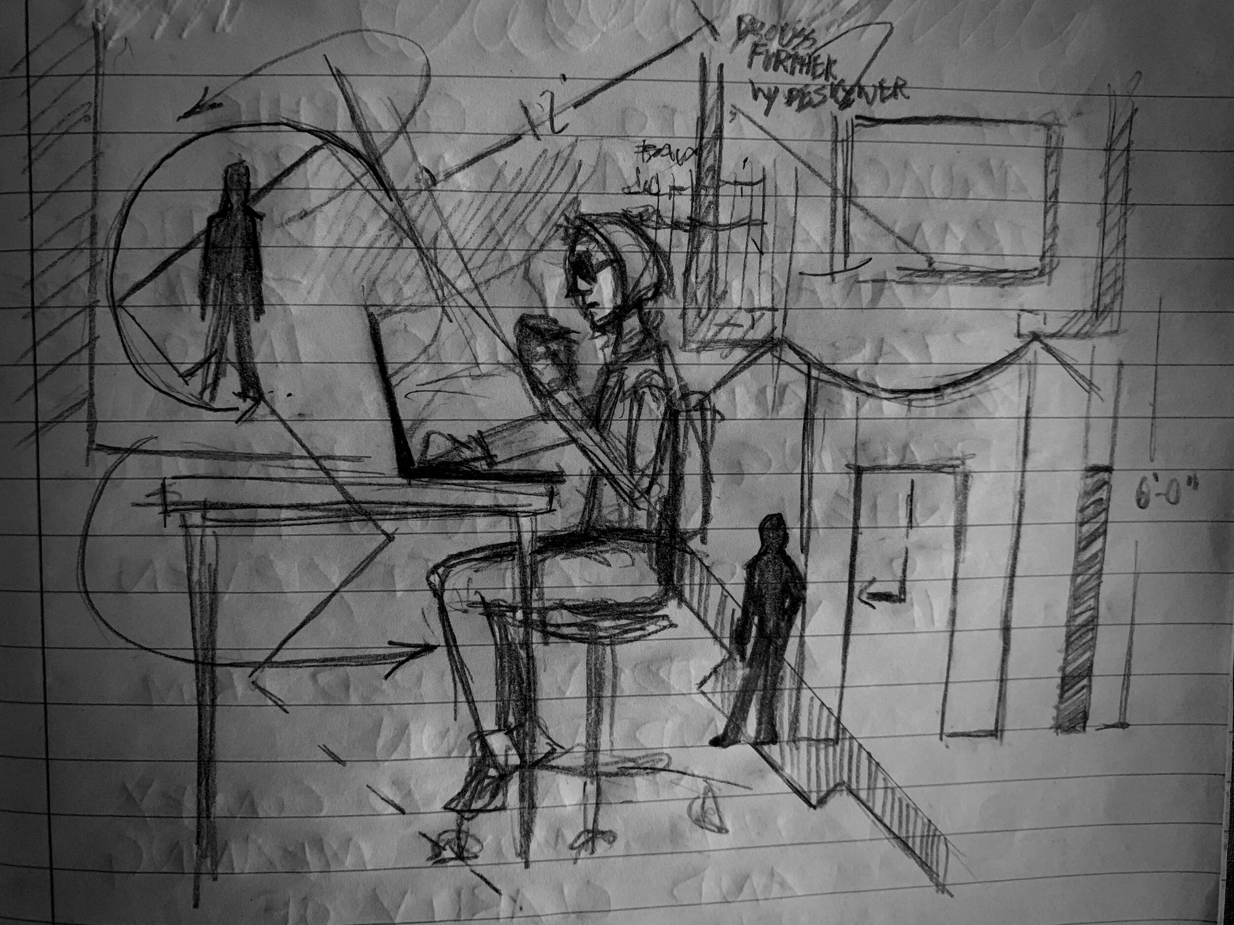
Okay, so if we had to break down the design process into food groups, drafting would definitely be the vegetables. I think it’s better think of drafting as a language more than a type of drawing. I mean, certainly at a glance it’s definitely a two dimensional rendering of three dimensional objects on paper. However, the purpose of that drawing is actually more about translation. It’s taking the ideas and images swirling in that artsy brain, and ordering them into recognizable symbols that can be deciphered by those who are responsible for translating those thoughts into physical reality.
It’s worth mentioning, yet again, that I’m speaking from the perspective of a USA based designer. Here in the States, the designer is asked to provide detailed drafting plates that give an ordered breakdown of all the pieces and their arrangements onstage throughout the course of the performance.
If I’m being completely honest, it’s the part that gives me the most pause. In a model or a sketch, you can elide certain details, suggesting shapes and such without going into tiny specifics. Drafting doesn’t allow for that wiggle room. Any detail you don’t show will become a question later. Anything you don’t address, you potentially leave open to the interpretation of another. Although this is a daunting task, it’s also a weighty gift to the designer. Within the drafting plate, you can say exactly how you want something to look. It’s not about how the thing is built (that’s for the technical director to figure out) but rather how it’s supposed to look. Everything is within your purview to decide and clarify using the drafting as an illustration of your decisions.
Drafting can actually be quite beautiful. It’s a language that has been used for centuries, buildings drawn with a careful and exact hand so that other crafts people and makers could carry out the task. As drafting has become more formalized through time, it’s core mission is simple; communicate the most information about a piece clearly and accurately. Drafting for scenery has a number of conventions, even down to the thickness of a line. Drafting is the science of scenic design; a methodical system of ordering our thoughts and choices in a way that can be measured and quantified.
In drafting, scenery is rendered as if you cut it up and laid it out in flat pieces; similar to the idea of cutting into a multi tier cake and getting a good look at the layers of cake and frosting. Although every package is a little different, there are some things that are consistent. The package for Little Shop began as most do:

Groundplan for Little Shop of Horrors
We begin with the ground plan of the whole set at what I would call it’s “resting” state; this is a personal designation that I make of how the set looks (usually) at the top of the show. This cut is as if we took a giant serrated knife through the whole theatre at a height of 6 feet (ish), and cut horizontally through. Everything we cut through at that height has the hatching (diagonal line pattern). Similar to the floor plan of a home, this shows us everything laid out in entirety with all the pertinent spacial information except for one; height. This missing aspect is addressed in the next plate:

The Section view of the set for Little Shop of Horrors
In this cut, we take that same giant knife and slice it through the whole theatre and set vertically this time, using the center line as our cutting line. Again, everything the knife actually cut through is hatched, and all other pieces are filled and lined according to position from that cut. Once you have shown these two big picture views, everything else you put in the packet is breaking down each piece of the scenery into a variance of the same views. Now, because I’m not a certain flavor of crazy, I will not subject you to the entirety of the packet for this show. However, let’s zoom in on one element and look at the plates to show how I wanted it to look. In case you couldn’t guess which element….

Close up of the ground plan of florist shop in Little Shop of Horrors
Indeed, what would this show be without the florist shop in some form right? For our show, we made it the dominant unit in the set for obvious reasons. Considering how much action this puppy had to hold, it took a couple plates to describe it.

Plate showing the Front, Plan, Section, and Details of the florist shop in Little Shop of Horrors

Plate shows the front facade of the shop that would have flown in and out during the show, closing and opening the shop as needed
The two plates shown above are examples of showing how an element is supposed to look. The views given help illustrate the necessary details. If there are things that might clutter the object if drawn, or might be unclear in that form, that’s where you put in the notes. The notes are an elegant and delightful way to illuminate the drawing with further detail without overcomplicating the drawing itself. Obviously notes can get out of control, but half the dance in the drafting is how you choose to arrange things. How everything aligns on the page matters. Where you put the notes within the drawing means something. The way you arrange your thoughts on the page will make the difference between your colleagues being able to read and understand your meaning efficiently and accurately, or being utterly baffled and needing you to constantly re-explain what you meant.
Now, for the final thing that drafting can do that is vital; showing how certain moves and shifts are supposed to work. In the case of Little Shop there were two major shifts. The first is when we go from the shop to the dentist office, which involved the shop tracking offstage and the elements of the dentist unit being moved on….

Dentist Office Shift Plan
This is a transition that would have been fully visible to the audience. The shop moving away reveals the silhouette of the city skyline in the far upstage, and the few elements that make up the dentist “office” (you’ll see the reason for the quotes when I show you the elevation of the elements in a later post) move into the space.
The other major transition in the show would have been completely invisible to the audience. It’s funny, but it’s probably the thing I am most proud of in this design, and it would have been something completely imperceptible to those seeing the show. We discussed this transition a lot on Squad Pod #1: A Chat with Team Puppetry; it’s the one where we load the largest of the four puppets into the shop for Act 2.

The Shift Plan for moving in Audrey 2.4 during intermission
See, the secret to this whole thing lay in one really smart choice that Will (one of the puppet designers) made in cahoots with Ed (department technical director and agreed to help in fabricating some of the framework for the largest puppet); that the puppet could store in pieces and then be put together in the final position. Thus, I was able to use just a couple sneaky secret doors that looked like walls when in audience sight, but could open with the front facade of the shop in place (blocking audience view) to allow for the puppet pieces to be brought into the shop for assembly.

Closeup of the Shift Plan
The hidden door in the mid stage unit would have swung downstage and been treated to look like a plywood construction barrier, masking the puppet’s movement up into the shop. The upstage wall of the workroom in the shop could swing upstage, allowing the puppet into the shop; a shade pulled across the facade window hiding everything from the audience.
I won’t pretend that I’m the most accomplished draftswoman. I definitely have much to refine and further perfect in how I communicate in this part of the process. However, I’m proud of this work. I made every effort to be clear, neat, and thorough. I came into graduate school with barely enough confidence to draft a box in Vectorworks, let alone a set with multiple moving pieces. It’s one of the things that I desperately wanted to improve while I was in school, and I achieved that goal. Again, much still to learn and explore, but Little Shop was a perfect show to test me in this facet especially. I feel confident that I rose to the challenge.